Do you recognize these names: Caldwell, Elmore, Easley, Fields, and Parkinson? If not, I’ll bet you’d recognize their work. These were arguably the most prolific and popular artists in D&D during the 1980s and 90s. Most of the D&D manuals, source books, adventures, novels and magazines of the 80s and early 90s featured the works of one of these five artists on their covers.
Each edition of D&D had a different type of art that was unique to that version of the game. Art of the original D&D consisted of a lot of line drawings. They were two dimensional and simple. With AD&D, the art was taken to a whole new level. It took on a realism that was, until then, uncharacteristic in role-playing games. Artists working to illustrate AD&D understood that just because dragons don’t really exist doesn’t mean they can’t be depicted as if they do.
This realistic approach was applied to more than the monsters. The heroes of various races and classes were shown battling these monsters of fantasy. You believed that this scene could really exist. The details were exquisite. The weapons and armor were authentic and accurate. With these works gracing the covers for D&D rule books, modules, magazines and novels it made you want to buy these books.
The artistic giants of AD&D were, unfortunately, left behind when the game was reinvented as 3e D&D. The artistic direction changed. I’m sure money was a factor and I’m sure there were internal politics. I don’t know all of the details and I wouldn’t bore you with them if I did, but 3e D&D paid less attention to the art and more attention to the new rules. Just look at the covers of the 3e books. For the first time they didn’t depict dragons or adventurers.
In the heyday of AD&D Caldwell, Elmore, Easley, Fields, and Parkinson were the best of the best. The images that these five created set the stage for D&D. You’d look at the heroes in their paintings and think, that’s what I want my character to look like. They were cool.
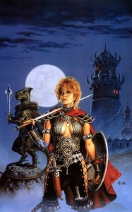
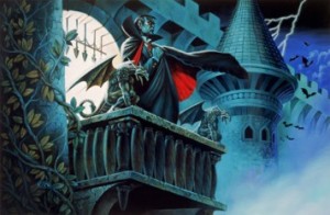
Clyde Caldwell
A lot of old school gamers will remember Caldwell’s work from the covers of the Gazetteer adventures. He did a lot of work for the Forgotten Realms too, including the memorable cover for the novel “Curse of the Azure Bonds.” But for me, the work I’ll always remember Caldwell for are the covers of the original Ravenloft and Ravenlot II adventures.
 |
 |
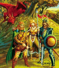
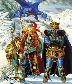
Larry Elmore
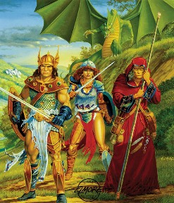
If you’re a fan of Dragonlance then you know the work of Larry Elmore. He painted the covers for all the early novels. This was in fact my introduction to his work. Although I never really got into the Dragonlance setting of the books, the cover art always fascinated me.
Elmore’s attention to detail was unmatched by his peers. When I created new characters I often looked to his work to draw inspiration. When I found a painting I liked I’d make a PC who fit that image.
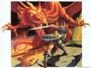
In addition to Dragonlance, Elmore may be remembered by the some of the older games for painting the cover of the original red D&D boxed set.
My favourite Elmore work has always been the cover for the first Dragonlance novel, “Dragons of Autumn Twilight.”
 |
 |
 |
 |
Fred Fields
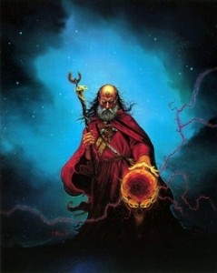
Of these five giants, Fields is the one whose work I liked the least. It was still great, don’t get me wrong, but there was something about his style that I didn’t care for. Of all his work, my favourite is the cover for the novel “Red Wizards.”
 |
Keith Parkinson
On October 26, 2005, Keith Parkinson lost his battle with Leukemia and died. He was 47 years old. I was shocked to learn of his death when I was researching this article. The man may be gone, but his work will live on.
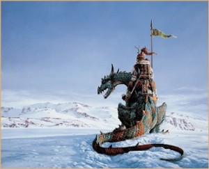
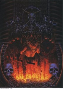
The covers for the Bloodstone modules have been favourites of mine for years, but Parkinson’s work “Lone Watch,” used as the cover for Dragon magazine #137 which featured a Ranger atop the lizard is probably my favourite of all his works.
 |
 |
Jeff Easley
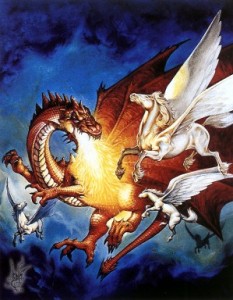
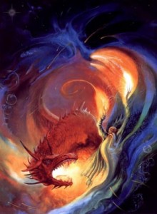
No one painted dragons like Easley. Many tried, but he was the master. TSR knew that when your game is called Dungeon’s & Dragons you need to get the artist who paints dragons the best to represent your product. Easley’s work was everywhere.
When the AD&D hardcover source books were given new covers in the early 80s, Easley painted new ones for every book including the PHB, DMG and Monster Manual. He also painted the covers for most of the AD&D 2nd ed. books too. You couldn’t pick up an official rule book with seeing one of Easley’s painting. He was probably the most prolific of these five artists.
With an artist who produced so much it’s hard to pick just one favourite. The first Easley cover I ever saw was for the AD&D Monster Manual, so this is one of my favourites. I also really liked the AD&D 2nd ed DMG cover.
 |
 |
With so many artists producing work for D&D over the years, I can’t even guess at how much is actually out there. The internet makes finding these works easier and easier. As with any artistic discussion there’s never a right or wrong answer. I’ve shared some of my favourites and encourage you to do the same. I’ll be doing a follow-up to this article in December. At that time I look at the D&D art that was produced in the wake of these five masters, including the works currently on the cover of the 4e books.
Additional Resources
Clyde Caldwell
Jeff Easley
Larry Elmore
Fred Fields
Keith Parkinson
Be sure to check out our follow-up post: The Art of D&D (part 2) and The Art of D&D (part 3).
 Looking for instant updates? Subscribe to the Dungeon’s Master feed!
15 replies on “The Art of D&D (Part 1)”
Funny… I was looking at some old D&D stuff I got a hold of this week and was thinking about the art.
These guys are what I think about when the aesthetic of D&D comes to my mind. I can’t really name any of the modern artists of the 3.x-4.0 era, yet these guys are still household names to anyone who played D&D back then.
The only complaint I’ll give about their work, and I’m sure it was more a product of the times rather than their individual sentiments, is that their worlds were populated strictly by White-Anglos… Not an African, Hispanic, or Asian to be seen anywhere unless it was to represent those spin off settings like the Oriental Adventures, etc…
This artwork always brings back good memories of my personal golden age of D&D.
.-= newbiedm´s last blog ..Warstories: The Game Recap =-.
Special mention should IMHO go to the amazing Tony DiTerlizzi. He not only gave life and face to the whole Planescape campaign setting, he also did most of the monster art in AD&D2E Monstrous Manual. 🙂
@newbiedm
I never thought about the fact that everyone is white. I agree that it was probably due in large part to the times. It’s nice to see that today’s artists are more influenced by the multi-cultural world around them.
@grue
Tony DiTerlizzi is the main focus of my next article on D&D art. He gave the powerful monsters in D&D the “presence” that you can’t get just by reading a description.
I really do love that older artwork, especially the way that characters and armor were drawn, but I offer up another complaint alongside of Newbiedm’s comment about anglicized characters: The male gaze is probably no more often found in art than in the art of 70s, 80s, and even 90s fantasy artists. Not all, of course, and many modern day artists definitely still do, but I feel like with 3rd and 4th edition, we’ve come along way towards giving female characters armor that covers more than a bikini would.
Obviously there are exceptions on both cases here, but I think, in the majority, Fantasy artwork has come a ways in terms of blatant sexism.
.-= skywise´s last blog ..Dawwww =-.
Cool, I look forward to the 2nd part then!
Also, Brom. 😀
That artwork is truly stunning. There was definitely something lost in the change to third edition, and it was the sense of atmosphere. Both the art and the writing style was different. Fourth edition has changed the tone all over again, this time being all about the action of the game, much like a classic comic book.
But this old art really creates a world that makes you feel small, where there are great wonders to be explored.
I also like how clothing used to make sense, and armor was allowed to be symmetrical. I’ve never understood why that changed.
.-= Jeff Carlsen´s last blog ..Why We Play: The Social Aspect =-.
Truly, one cannot overestimate the role of art in our hobby. In some ways, it was the artwork that raised the profile of rpg during it’s golden decade. For many, myself included, the art in those books was the initial attraction, triggering the imagination even before one had a chance to appreciate the written content. Many a time I looked at the illustration and though: “I want to play this!”. This may be a nostalgia-fuelled impression to a degree, but still I feel that some of those artpieces were equally important and defining to those settings as the writings. Artwork of AD&D in particular, although not surprisingly all things considered, is rich with such pieces. I don’t think anyone can think of Dragonlance without Elmore’s rendering, or DarkSun without Brom’s oft grotesque visions. I agree that Caldwell’s Ravenloft covers are likely the best of his contributions (blimey the man knows how to paint women!) but if I were to choose my favourite piece it would have to be Forgotten Realms Adventures cover which at the time I considered nothing short of perfect. I often find it amusing that the sheer glimpse of his signature symbol in any artwork would be synonymous with AD&D. I, too cherish Elmore for the whole Dragonlance cycle, especially the poignant Death of Sturm, but his original Shadowrun cover is very close. I like quite a few of Easley’s works especially the revised 2nd edition covers, however there are three of his works which I often go back to: the toned down Drizzt picture from Sojourn cover (still not as good as Brom’s brooding portrait), Al Qadim Arabian Adventures (fantastic colours), and the awe-inspiring depiction of Khelben Blackstaff vs the undead on the cover of The Magister sourcebook (looks like Blackstaff anyway 😉 ). Finally, late Keith Parkinson, probably my favourite of the great four. There are just too many of his works which are absolutely stunning. His realistic style, attention to detail and composition come together to create artworks which are often simply breathtaking. You’ve praised Easley’s dragon talent well I dare to disagree and Keith’s Great Red Dragon or the Ice Dragon are a fine testament to that. Another great example is the iconic The Big Stash (dwarves emerging from the dungeon); Lone or North Watch is also one of my favourites but there is also one which for me is more significant, perhaps not for its artistic values (although I like it) or epic scale but what it is associated with: the lone rider from the the Grey Box cover. I realise that’s probably my sentiment for that first edition that’s motivating this choice but hey isn’t it always the case?
That art is very much part of the TSR legacy and I find it heartwarming that whilst the hobby industry moved on, those illustrations still mange to inspire gamers, certainly myself, with the good old fashioned sense of fantasy. Good times. Waiting for the part two, someone already mentioned Tony DiTerlizzi and you hinted that he will be featured in the following article (Brom no doubt as well 😉 )
On the side note, it’s a very interesting comment regarding the ethnicity of the characters and it’s true that Caucasian seems to have been the dominant model in the graphics. I think that’s due to the focus of a particular basic region of the setting which usually was based on medieval European tradition. On the other hand, I suppose that the difference between human and other demi-human races was more highlighted at that time. I don’t necessarily agree however that the art implied that whole worlds were mono-ethnic. Even though the non-Caucasian ethnic groups were primarily featured in the illustrations for the spin off sub-settings (e.g. Al Qadim) those settings usually originated from regions in the parent setting (e.g. Kara Tur or Zakhara in FR), so for me at least wide ethnic variety was always there. Also, note some of the iconic characters like Theros Ironfeld or even that rider from the Grey Box (he looks to be based on an Asian invader archetype) imply a varied ethnic landscape.
@skywise
I think you’ve summarized the situation perfectly.
@grue
Brom’s good too. He’ll be included in part 2.
@Jeff Carlsen
I’m often curious as to how much of what we see is accurate vs the artist trying to make things look cool.
@Voidman
Wow, you’re really passionate about the art of D&D. Thanks for sharing your personal favourites. You’ve certainly given me a lot to consider before I write part 2 in December.
Wow, great post. Inspired me to order a Larry Elmore poster right away! I just had to have the classic, iconic, D&D image from my old basic set…
.-= The Recursion King´s last blog ..Finding my own style – a years journey =-.
[…] over the years, but only the greatest left a lasting impression on the game and its fans. In The Art of D&D (Part 1)we looked at five of the greatest artists ever associated with D&D: Caldwell, Elmore, Easley, […]
[…] by it. Two of our most popular articles here at Dungeon’s Master are The Art of D&D (Part 1 | Part 2). My purpose here isn’t to go back as Ameron did and talk about artists who have […]
[…] Jeff Easley for show pieces or Wayne Reynolds for action […]
[…] the Art of D&D (Part 1) we looked at the five giants who’s worked graced the covers of almost every D&D product in […]
Dave Trampier!!!
@exit(0)
Check out The Art of D&D (Part 3) in which we look at work by Jeff Dee, Will McLean, David C. Sutherland III and David A. Trampier.