 Role-playing games like D&D are the theater of the mind. The characters and events are only as real as the participants imagine them. For new players this can be overwhelming. After all, in a fantasy setting there are going to be a lot of things that your character should be familiar with but you, as an inexperienced player, have never heard of. This includes everything from exotic weapons to strange monsters. This is why the D&D books have always been rich with art.
The covers of most D&D books depict scenes where heroes battle monsters in some lavish and clearly fantastic setting. This draws you in and gets you to pick the book up (an important first step), but the interior art plays a very important role as well. It’s the interior art that’s going to fill in those blanks we’re talking about. In the original AD&D hard cover rule books the interior art did an amazing job of unlocking the imagination and guiding new players towards the world of Dungeons & Dragons.
Throughout April Dungeon’s Master is participating in the Blogging from A to Z Challenge. The challenge is to write a new article ever day in April, excluding Sundays. That’s 26 articles over the course of the month. To make things even more interesting the title of each article will begin with a different letter of the alphabet. In today’s article we return to a popular subject and one we’ve written on before: The Art of D&D, our “A” topic to kick off the month.
In the Art of D&D (Part 1) we looked at the five giants who’s worked graced the covers of almost every D&D product in the late 80s and early 90s: Clyde Caldwell, Jeff Easley, Larry Elmore, Fred Fields and Keith Parkinson. Their realistic depictions of the fantastic made you believe that the places in your D&D fantasy adventure could actually exist.
In the Art of D&D (Part 2) we looked at the artist who picked up the torch and ran with it through D&D as new worlds and new campaign settings were introduced. Brom showed us Dark Sun, Tony DiTerlizzi showed us Planescape, and Wayne Reynolds showed us Eberron. Each setting established a brand around the art work of these three greats.
This time around in the Art of D&D (Part 3) we’re going to go back to the beginning and look at the original interior art from some of the first AD&D hard cover rule books: Players Handbook, Dungeon Masters Guide, Monster Manual and Deities & Demigods.
The art that graces the covers of these books has become iconic in and of itself, but I’m not as interested in that today as I am in the interior art. Those simple black and white sketches harness a raw energy that was vital at the beginning of D&D. With so much of the game stemming from the imagination of the creators it was necessary to provide some illustrations.
Most of the interior art was provided by a few talented artists who don’t often get the credit they deserve. Their small, simple sketches are forgotten and overshadowed by D&D’s artistic giants such as Easley and Elmore. But each of these contributors made their mark on D&D and holds an important place in the game’s origins. Let’s shine a spotlight on these pioneers and give them some much-deserved recognition.
Jeff Dee
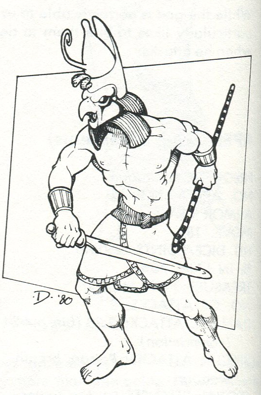
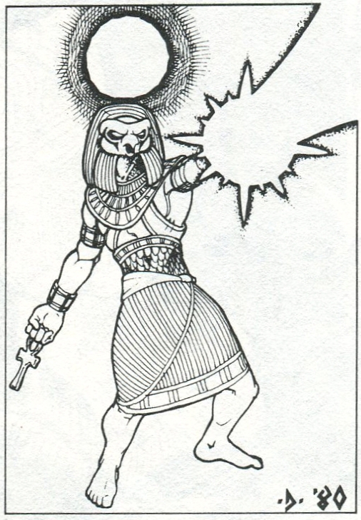
Deities & Demigods has always been one of my guilty pleasure D&D books. It’s a monster manual full of gods. The idea of comparing the deities of different myths to one another using D&D stats is something I’ve always found appealing. What kept me interested in this book long after I determined which god would win in a fight was the art. The work of Jeff Dee specifically blew me away. After seeing his depictions of the Egyptian and Norse gods I could never read their names and not immediately call to mind Dee’s images of them. They were beautiful, powerful and majestic; everything you expect from a deity. I didn’t need colour, I was in awe by the simplicity of these black and white renditions.
 |
 |
 |
 |
Will McLean
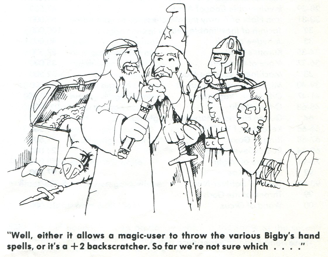
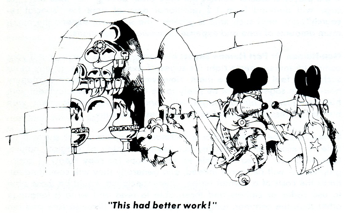
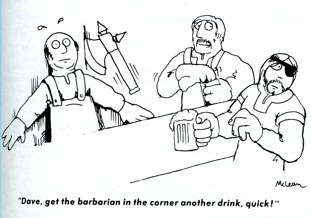
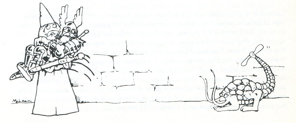
All you have to say is “+2 backscratcher” and every old school D&D player will immediately know what you’re talking about. MacLean’s work graced numerous pages inside the original rule books. They were always simple and funny. These served as an important reminder that D&D is a lot of fun. You should be having fun as a player and it’s ok for your character to have fun too. McLean’s comic strips were the precursor to the Dragon Mirth section at the back of the old Dragon Magazines. His work is so ingrained in the minds of players and DMs alike that his cartoons are as much a part of D&D as a Bag of Holding or a Magic Missile spell.
 |
 |
 |
 |
David C. Sutherland III
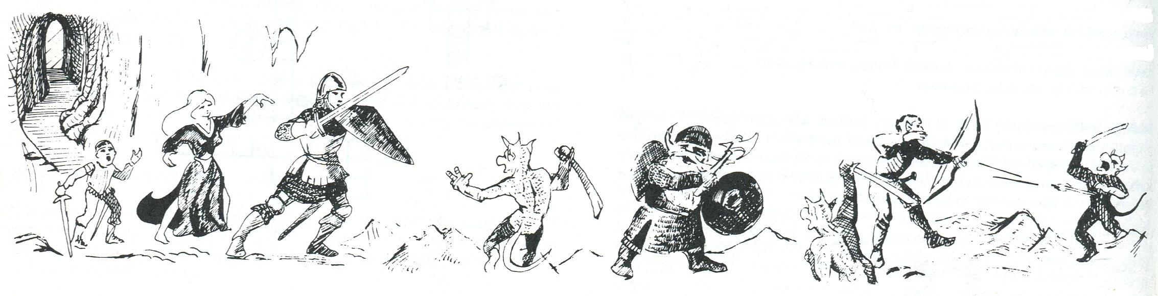
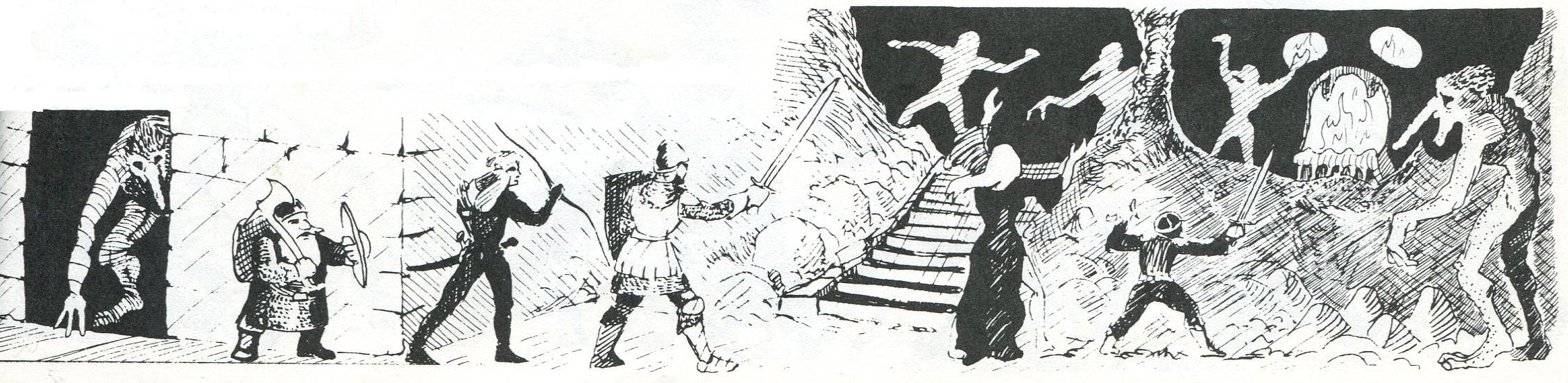
Along the bottom of four consecutive pages near at the end of the DMG there are pictures of adventurers trekking through an underground cavern and fighting monsters every step of the way. When I saw this for the first time I realized that this is what a D&D adventure is supposed to be like – danger and excitement, exploration and combat, all at the same time.
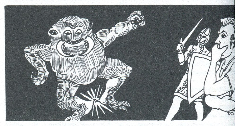
Sutherland’s work may look simpler when compared to the others listed here, but that didn’t mean it wasn’t good or powerful. His work was peppered throughout the PHB showing adventurers using spells. In a world of magic this was waht it might look like when the spells were cast. The Umber Hulk doing Otto’s Irresistible Dance is a personal favourite and always brings a smile to my face.
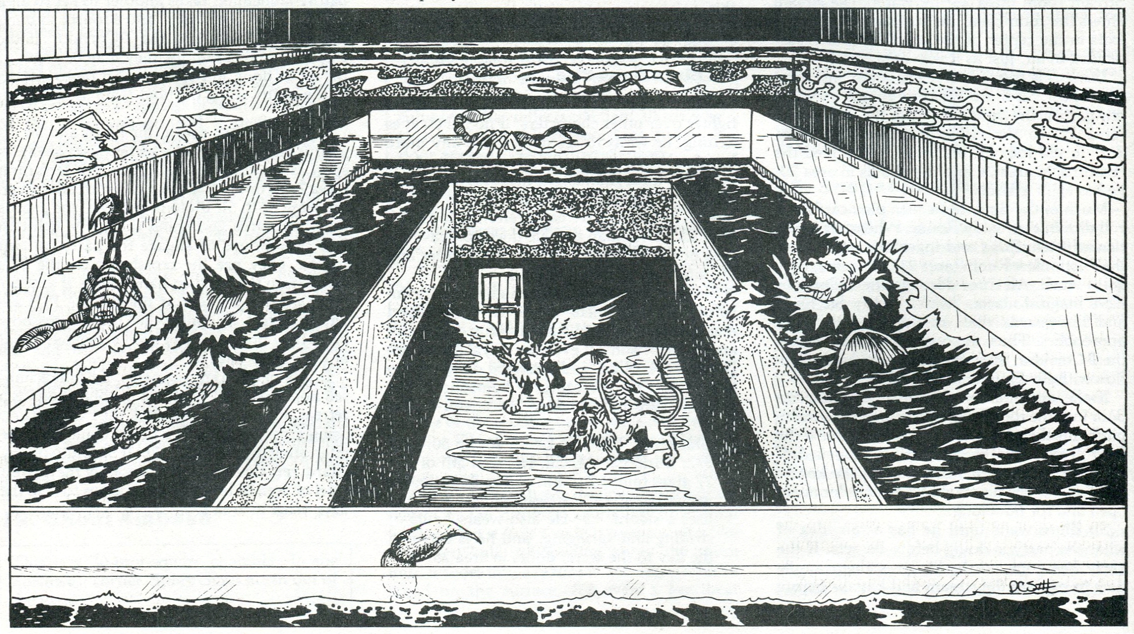
In addition to the his many contributions to the PHB, Sutherland drew pictures for some of the most classic and beloved D&D adventures. Who could forget the multi-tiered zoo from White Plume Mountain.
 |
 |
 |
 |
 |
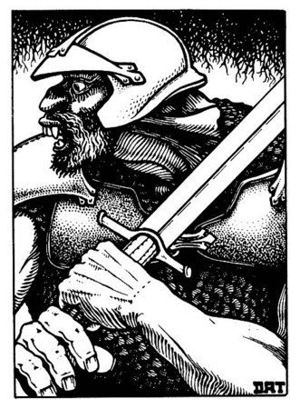
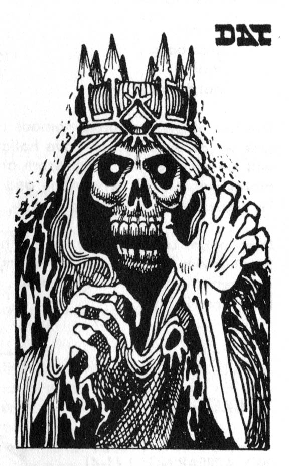
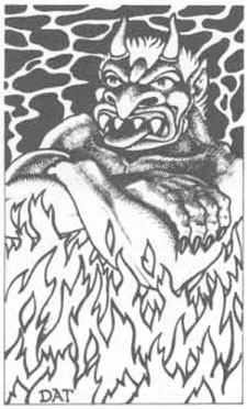
David A. Trampier
Some of the very best work from the original Monster Manual is signed DAT. It always seemed to be darker than the rest of the black and white drawings, but that’s usually because there was so much detail and so much going on. Why just draw a monster when you could draw him as part of a scene. Each of Trampier’s illustration is practically an adventure hook in itself. The monsters usually look like they’re in the middle of doing something and creative DMs have been deciding what that something is for decades.
My favourite of DAT’s work is probably the one most people remember – the three adventurers opening a treasure chest that graced the last page of the original Monster Manual. This wasn’t a small thumbnail sketch like so many of the other pictures in this book; here was a full page drawing. Wizards of the Coast had Wayne Reynolds pay homage to DAT’s iconic scene by giving it an updated look as the cover of the Adventurer’s Vault 2.
 |
 |
 |
 |
| David A. Trampier | Wayne Reynolds |
 |
 |
See more examples of work from Jeff Dee, David C. Sutherland III, and David A. Trampier in the Tomb of Horrors Art Gallery.
When you think back to the original D&D hard covers which of the black and white drawings do you remember most vividly? If you had to pick just one, which is your favourite? How many people asked their DM for the Bigby’s Wand from MacLean’s cartoon for their Wizard? (I know I wasn’t the only one.)
 Looking for instant updates? Subscribe to the Dungeon’s Master feed!
4 replies on “The Art of D&D (Part 3)”
I have to admit that I never played D&D before, even though role-playing intrigues me.
Loved the art you shared. Thank you.
BTW, I’m the minion patrolling your blog’s section of the participant list, so I’ll be by again soon. 🙂
My Writing Blog
My Life Blog
I really like the old skool artwork.
For me, it’s this one by Darlene:
http://www.paperspencils.com/wp-content/uploads/2012/06/Wizard_In_The_Night_By_TheShore_By_Darlene-600×374.png
[…] The Art of D&D (Part 3) […]